

[wzslider autoplay=”true”]
Exhibition of designs by Miodrag Spasojević Štrika titled “Identity” will be opened tomorrow, on September 16, in the Art Gallery of BiH.
Miodrag Spasojević Štrika used elements of the old Bosnian letter to give identity to the premium wines of Herzegovina.
In the end, and one might say even in the beginning, it turns out that every art, especially the applied one, is grounded on simplicity. Whether it is visual, textual or musical form – where you can apply a theme or a verse on more things across more levels – this thing proves to be more successful. In our time, design is, however, in majority of cases a segment of market game in which it is being presented as a element of offer which is supposed to result in sale. That is the law of the time we live in. However, the history of advertising teaches us that successful does not always mean good. Increasingly aggressive attacks on potential buyers seem to reduce the space for true design, the one that has something to reveal, a message to send, something to show.
But, it is all a game. In this case, the starting point was inverted logic, in which the academic graphic designer Miodrag Spasojević Štrika created a logical blend of different energies, different details that might have stayed forever disconnected, by thinking extensively about the product that has been produced in his neighborhood, in Ljubuški, since forever. As in other activities, design has identity as one of its primary tasks. New culture theories teach us that every identity is a construct. A step ahead in this sense is made because of all the details that we see on labels and other promotional materials for the Vinery Buntić. All those things function together as a kind of super construct. We are what we make of ourselves, what we make of the content that finds us. Grapes give wine, and letters and symbols give design. Golden letter for Žilavka, a tendril as a stylish letter, a musical note for Blatina, and Bosnian Cyrillic – the national letter that should bring the complex structures closer to the ordinary world. Once upon a time, Bosnian Cyrillic was used to write epitaphs on tombstones. Today, in Štrika’s performance, it is a symbol for wine. Organic, one might say.
And all those details “dance” in some kind of harmony, which eventually builds that identity. The identity of the Vinery Buntić: everyone who knows the fundamental nature of this wine producer can say that this move is almost revolutionary.
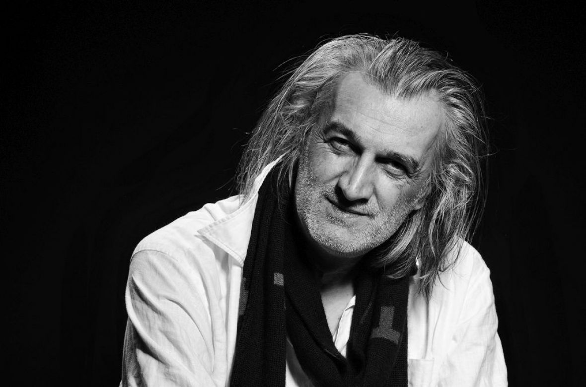
Štrika’s designer handwriting is something deeply recognizable in decades of visual information that are behind. Some of his works that are worth of attention are the symbol of the Post Telegraph Telephone Service (PTT) or the Basketball Federation of BiH. These symbols are among the best examples of this practice in this country because they are everything that a good design is supposed to be. They place the idea taken from nature or some other medium into a different context, a context that enters the subconsciousness of the viewer and creates a different image and perception of the symbol.
A design depends on many factors: following the main idea, results of analysis, influence of the ordering party, the concept that comes after synthesis or together with it, as its organic part. If, for examples, drawings in Altamira, showing a man hunting and an animal running away, foreshadowed the direction of the development of visual art – all the way to the moving pictures, film – wasn’t the foundation of design created then, with the choice of color or the placement of a bull on the wall or the choice of a human arm in space? All we see or hear later will undoubtedly remind us of those images, where we get to the image of a tendril which stands for a stylish letter “B” through a series of associations. A work of art must suggest why it was created and it must reflect time and place where it was created.
If something is almost timeless, like wine, then it should be presented with something also timeless, such as the Bosnian Cyrillic. If it can lead us further, then the vine is the foundation around which the entire context bends. In this case, the tendril bends in the form of the first letter of the last name of the winemaker whose product is the subject of the design process. If that process is completed successfully, then we can speak about something that enters collective memory.
The most important thing for a design is that it lives. In order to live, a design needs someone to create it and someone to look at it.
(Source: Ahmed Burić for radiosarajevo.ba)


